

The quietest-looking slab isn’t always the best stone for a minimalist kitchen design. A restrained room can feel flat without some natural movement, while a bold vein or busy pattern can compete with clean cabinetry and uncluttered lines. The right choice depends on how much visual character the rest of the kitchen can carry.
If you’re weighing veined natural stone against a more consistent engineered surface, the decision comes down to the look you want and how the stone will relate to the rest of the room. Minimalism leaves little room for a material that feels out of place. This guide compares quartzite, quartz, granite, marble, and porcelain by visual character and design fit, then walks through a practical way to assess a slab alongside cabinetry, lighting, and hardware. Infinity Stone supplies natural and engineered stone slabs in Ontario, so you can begin your selection with the material itself: a considered foundation for a kitchen designed to feel calm, personal, and enduring.
Key Takeaways
- The best stone for a minimalist kitchen design depends on how its colour, veining, and texture balance the room, not on a single universal winner.
- Compare quartzite, quartz, marble, granite, and porcelain by visual character and how each supports your design priorities.
- Use a consistent method to assess slab colour, contrast, and movement before choosing a surface.
- Bring cabinetry, flooring, lighting, backsplash, and your intended focal point into the slab-selection process.
- Explore natural and engineered stone slabs from Infinity Stone, a Mississauga-based supplier serving Ontario.
What Makes Stone Work in a Minimalist Kitchen Design?
Minimalist stone selection means choosing a surface that supports a calm, deliberate composition. The goal isn’t to remove every detail, but to decide which elements deserve attention and how they relate. Colour sets the room’s overall tone; veining and pattern introduce direction and movement; contrast defines edges; and texture affects how light reads across the surface. Together, these qualities shape the kitchen’s visual rhythm.
Visual restraint in kitchen stone comes from a considered colour relationship, controlled pattern movement, deliberate contrast, and a texture that supports the room’s overall composition.
This approach reflects the principles of minimalism, where clarity comes from editing and intention. Natural variation can belong in a minimalist kitchen when it feels balanced with the cabinetry, flooring, and other prominent finishes. The best stone for a minimalist kitchen design is the slab that contributes the right amount of character, not necessarily the one with the least pattern.
How stone contributes to a calm, cohesive kitchen
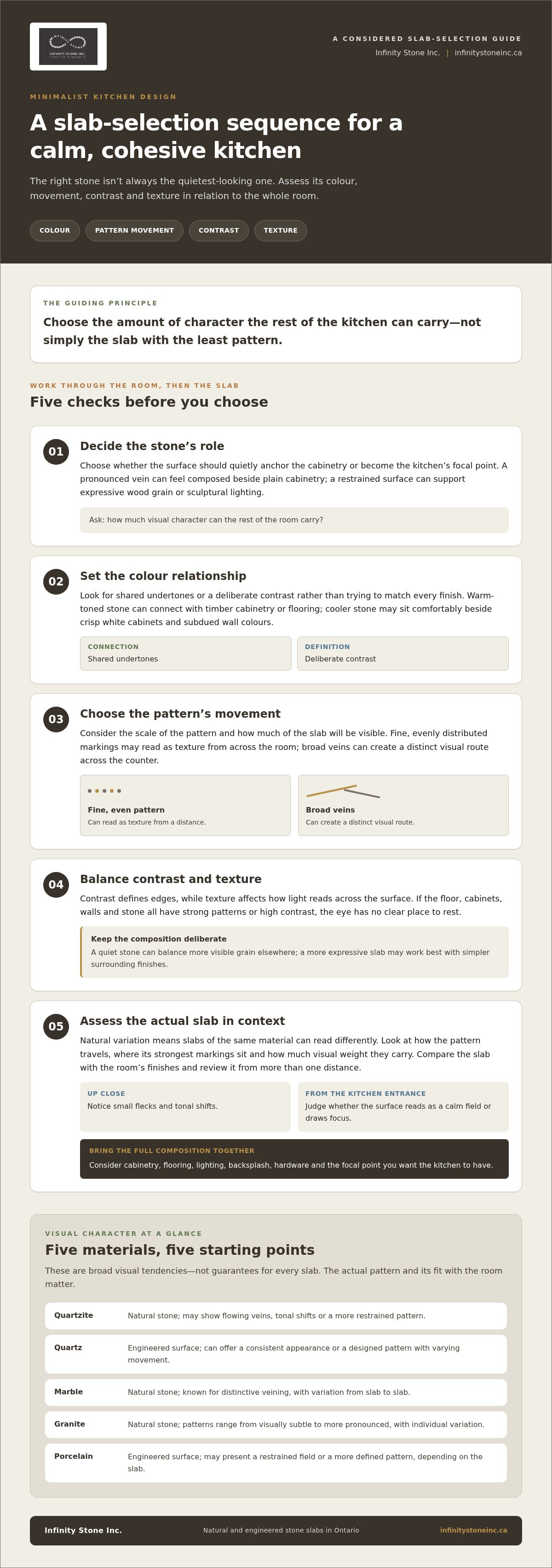
Think of the stone as one part of a material composition. A warm-toned surface can connect with timber cabinetry or flooring, while a cooler stone may sit comfortably beside crisp white cabinets and subdued wall colours. Rather than matching every finish exactly, look for shared undertones or a deliberate contrast that makes the elements feel related.
One dominant surface can create continuity when its colour carries across a counter and backsplash, or when a restrained stone anchors cabinetry with more visible grain. A subtle shift in tone between the counter and cabinets preserves definition without breaking the palette into competing blocks. By contrast, if the floor, cabinets, walls, and stone all have strong patterns or high contrast, the eye has no clear place to rest.
Scale matters, too. A fine, evenly distributed pattern may read as texture from across the room, while broad veins can create a distinct visual route across the counter. Consider how much of the slab will be visible and whether that movement will sit quietly beside cabinet lines or become the kitchen’s focal point.
Does minimalist stone need to be plain white?
No. Minimalism doesn’t require a uniform colour or pattern-free slab. A softly varied neutral can add depth without drawing focus; subtle movement can lend natural character; pronounced veining can create a confident focal point. These are different design choices, not a hierarchy from “minimalist” to “too busy.”
Judge the stone against the full room palette. A strongly veined slab may feel composed beside plain cabinetry, simple flooring, and quiet wall colour. The same slab could feel crowded if the backsplash and floor also have prominent patterns. Conversely, a nearly uniform surface may suit a room with expressive wood grain or sculptural lighting, but appear stark when surrounded by equally smooth, pale finishes.
Review the pattern from more than one distance. Up close, small flecks and tonal shifts may be noticeable; from the kitchen entrance, the same surface may read as a calm field. This perspective helps you decide whether the stone’s movement supports the room’s rhythm or pulls attention away from the composition you want.
Quartzite, Quartz, Marble, Granite, or Porcelain: How the Options Differ
Each material offers a different visual language, from the individual movement of natural stone to the more controlled patterns possible with engineered surfaces. The right fit depends on the character you want the stone to bring and how it will sit alongside the rest of the kitchen.
| Material | Category | Visual character | Design fit |
|---|---|---|---|
| Quartzite | Natural stone | May feature flowing veins, tonal shifts, or a more restrained pattern. | Brings natural movement to a composed palette; the slab’s pattern helps determine its visual presence. |
| Quartz | Engineered surface | Can offer a consistent appearance or a designed pattern with varying degrees of movement. | Suits kitchens where a controlled colour and pattern relationship is a priority. |
| Marble | Natural stone | Often recognized for its distinctive veining, with variation from slab to slab. | Can serve as a focal surface or add a measured layer of natural character. |
| Granite | Natural stone | Patterns range from visually subtle to more pronounced, with individual variation. | Works with minimalist schemes when its pattern scale and contrast complement surrounding finishes. |
| Porcelain | Engineered surface | May present a restrained field or a more defined pattern, depending on the slab. | Offers a sleek visual direction for kitchens built around clear lines and a considered palette. |
Natural stone: variation, veining, and individual character
Quartzite, marble, and granite are natural stones, but they don’t create the same impression. Quartzite may show sweeping movement or quieter tonal shifts; marble can introduce expressive veining; granite spans a broad range of pattern scales and contrasts. These descriptions are starting points, not guarantees about every slab. Natural variation means that two slabs of the same material can read differently in the same room.
Assess the actual slab rather than relying only on a small sample or a material label. Look at how the pattern travels across its surface, where the strongest markings sit, and how much visual weight they carry. For more context, explore the material-specific guides to premium quartzite slabs in Ontario and marble slabs for luxury design.
Engineered quartz and porcelain: a different design language
Engineered quartz and porcelain are distinct categories, and neither is natural stone. Their appearances are designed, with options that can read as relatively consistent or suggest stone-like movement. That can help if you want a more controlled pattern, though the specific slab still matters: colour, contrast, and the scale of its markings affect how it reads in the room. See the guide to luxury porcelain countertops in Ontario for more detail.
No category is an automatic winner. Compare each candidate against your cabinetry and finishes, then decide whether the stone should recede or hold the eye. To explore these material categories in Ontario, browse the selection at Infinity Stone’s stone slabs.
How to Compare Stone Slabs Without Losing the Minimalist Look
A slab can look understated on its own and become dominant once it’s set against cabinetry, flooring, and wall colour. Compare candidates in the context of the kitchen, not as isolated samples. Use the same visual questions for each option, and decide whether the stone should blend into the palette or become its defining feature.
Compare minimalist kitchen slabs by checking colour, veining, contrast, and overall movement against the room’s finishes.
- Colour: Look for compatible undertones beside cabinet doors and flooring. A surface that seems neutral on its own may read warmer or cooler in context.
- Veining: Note the direction, spacing, and strength of prominent lines, as well as how much of the slab they occupy.
- Contrast: Consider how strongly the pattern stands out from its background and whether that contrast repeats elsewhere in the room.
- Movement: Step back and assess the pattern as a whole. Does the eye travel gently across the surface, or settle on a distinct feature?
These checks make comparisons more consistent. The best stone for a minimalist kitchen design isn’t necessarily the quietest option: a subtle slab can recede and support a seamless composition, while stronger movement can establish a focal point. The choice depends on what else is already asking for attention.
Assess colour, veining, and pattern scale together
Place slab samples beside cabinet and flooring samples, then compare them up close and from across the room. Fine tonal movement may read as a soft texture at a distance; large, high-contrast veins can create a stronger visual path. Decide whether that path supports the kitchen’s lines or competes with them. If the stone should blend in, look for a closer relationship between its background colour and the surrounding palette. For a focal surface, allow more contrast, but keep nearby finishes quieter.
Balance visual simplicity with natural character
A restrained palette doesn’t have to feel flat. Gentle shifts in colour or a subtle pattern can add depth without introducing another bold feature. Lighting also matters: daylight and artificial light can change how a slab’s undertones and markings appear. Compare candidates under lighting similar to what the kitchen will have, rather than relying on a showroom impression alone.
For example, plain cabinetry, simple flooring, and understated hardware can give an expressive stone surface room to stand out. If the flooring already has pronounced grain or the backsplash carries a strong pattern, a quieter slab may create a more settled composition. Neither approach is inherently more minimalist. The measure is whether each finish has a clear role.
Use this comparison process to narrow the field before making a final selection. Exploring stone slabs for kitchen design can help you consider different natural and engineered surfaces in relation to the look you want.
A Practical Slab-Selection Checklist for Ontario Kitchen Projects
A clear brief turns slab selection from an open-ended search into a focused design decision. Before comparing materials, write down the kitchen’s fixed finishes, lighting conditions, and intended focal point. This gives each candidate the same context and makes it easier to see which slab supports the overall composition.
Build a shortlist around the kitchen palette
Record the cabinet colour, flooring tone, hardware finish, backsplash direction, and amount of natural light. Add whether the stone should blend into the palette, introduce subtle texture, or provide the room’s main contrast. Use these priorities to narrow the material options by visual character first. Then compare individual slabs within the shortlist instead of weighing every colour and pattern at once.
- Set the design brief. Gather cabinet and flooring samples, note wall and backsplash colours, and identify the hardware finish. Include lighting conditions and the intended focal point, such as a statement island or a quieter perimeter counter.
- Choose the stone’s role. Decide whether the surface should recede, add gentle movement, or draw the eye. This helps establish an appropriate level of colour contrast and pattern before you review specific slabs.
- Narrow by visual character. Compare broad qualities such as warm or cool undertones, subtle or pronounced veining, and fine or large-scale pattern. Set aside options that conflict with the design brief.
- Review candidate slabs. Where practical, view the full slabs in person. A small sample or representative image can help with an initial comparison, but it may not show the complete distribution of colour and pattern.
- Recheck the room relationship. Place a sample or representative slab image beside cabinetry, flooring, and backsplash references. Consider how the stone reads under different lighting and from more than one viewing distance before making a decision.
Review the actual slab before making a decision
The full slab reveals details that a small sample can conceal: where prominent markings fall, how veins travel, and whether one area carries more visual weight than another. Compare shortlisted slabs under different viewing conditions when possible. A pattern that feels balanced up close may read differently across a larger surface. Keep adjacent finishes in view throughout, so the final choice supports the kitchen as a whole.
For more context on planning a selection in Ontario, the Ontario stone slab sourcing guide offers a useful companion to this checklist. The best stone for a minimalist kitchen design is the slab that meets the project’s visual priorities in its real setting, not simply the one that looks most appealing on its own. Explore stone slabs for your kitchen project as you refine the shortlist.
Explore Minimalist Kitchen Stone Slabs with Infinity Stone
With the design direction defined, compare stone slabs against the kitchen’s palette and intended focal point. Infinity Stone Inc., a Mississauga-based supplier of premium stone slabs in Ontario, offers natural and engineered materials for residential projects and design professionals. Its selection includes quartzite, quartz, granite, marble, and porcelain, giving you distinct visual starting points as you refine a shortlist.
Think of the slab as part of the room’s composition, not a standalone finish. If tonal calm is the priority, assess how a candidate’s background colour relates to cabinetry and flooring. If natural variation appeals to you, consider whether the pattern’s movement feels balanced with the other finishes. For restrained contrast, compare the slab’s strongest markings with the kitchen’s existing lines and focal features.
Match the material category to the design direction
Natural stone and engineered surfaces offer different design languages. Quartzite, marble, and granite bring natural variation, so the appearance of an individual slab matters. Engineered quartz and porcelain offer designed patterns that can read as more consistent or introduce deliberate movement. These are broad starting points, not guarantees of a particular look. Compare the actual visual character of each candidate with the room brief.
Before exploring slabs, bring your palette references and comparison criteria together. Note whether you’re seeking a quiet field, organic movement, or a surface with more defined contrast. That simple brief helps keep the search focused across categories, without assuming a material will always look a certain way.
- For tonal calm: Focus on the slab’s overall colour and how much its pattern stands apart from the background.
- For natural variation: Review the distribution and direction of markings across the slab.
- For restrained contrast: Consider how the stone’s strongest details relate to cabinet lines, hardware, and backsplash.
The best stone for a minimalist kitchen design is the one that supports your priorities in the full room. A more consistent surface may help maintain visual continuity, while a naturally varied slab can add character when surrounding finishes leave it space to read clearly.
Take the next step from inspiration to selection
Infinity Stone supplies quartzite, quartz, granite, marble, and porcelain slabs. Slab supply is distinct from countertop fabrication and on-site installation, so keep your project’s next steps clear as you plan. Carry cabinet, flooring, backsplash, and lighting references into your comparison, and assess the slab in relation to these neighbouring surfaces rather than as an isolated sample.
Explore Infinity Stone’s stone slab selection and begin a project-specific shortlist. The strongest choice is the one that feels considered in context, with colour, pattern, and contrast working together across the kitchen.
Let Your Kitchen’s First Impression Take Shape
A stone surface becomes part of the kitchen’s daily backdrop, not just a finish to admire on selection day. Before settling on a slab, picture the room in use: morning light across the counter, cabinetry framing the surface, and the everyday details that gather there over time. The best stone for a minimalist kitchen design should feel intentional in that setting, with enough character to remain engaging and enough composure to let the rest of the room breathe.
Give yourself room to choose with care. A shortlist based on the atmosphere you want can make the final decision clearer, whether you’re drawn to tonal subtlety or a more expressive natural pattern. Explore options while keeping the kitchen as a whole in view.
Explore premium stone slabs for your kitchen project and find a considered starting point for the design ahead. Your minimalist kitchen can be both beautifully restrained and distinctly yours.
Frequently Asked Questions
What is the best stone for a minimalist kitchen?
There isn’t one best stone for every kitchen; the best stone for a minimalist kitchen design is the one that supports your room’s palette and desired level of visual interest. If you want the cabinetry to remain the focus, consider a slab with quieter patterning. If the kitchen has simple, uninterrupted finishes, a stone with more movement can provide a purposeful point of interest. Compare actual slabs with your design choices before deciding.
Is quartz or natural stone better for a minimalist kitchen design?
Neither is inherently better; the choice depends on whether you prefer a more controlled appearance or natural variation. Engineered quartz can suit a design brief centred on consistent colour or pattern. Natural stones such as quartzite, marble, and granite bring individual differences that may give the kitchen a more organic character. For an Ontario project, consider how the selected slab will relate to your lighting and finishes, then decide based on its appearance in context.
Can marble work in a minimalist kitchen without looking too busy?
Yes. Marble can feel composed in a minimalist kitchen if its veining has the right scale and contrast for the surrounding finishes. A slab with prominent markings may work as the room’s main feature beside simple cabinet fronts and a restrained backsplash. If several finishes already have strong patterns, a more softly veined slab may create a calmer balance. Review the entire slab, since the placement and spread of its veining can influence the overall effect.
How do I choose a stone slab that complements minimalist cabinets?
Start by identifying the cabinets’ undertone, finish, and visual weight. A pale, smooth cabinet front may pair well with a stone that introduces gentle contrast, while visible wood grain can call for a quieter pattern nearby. Bring a cabinet sample or a clear reference image when comparing slabs. Check whether the stone’s background colour feels harmonious and whether its strongest markings compete with cabinet lines or reinforce the kitchen’s intended focal point.
Does a minimalist kitchen countertop have to be white?
No. White is only one option, and a minimalist kitchen can use other restrained colours without losing its clarity. Soft beige, warm grey, muted green, or a deeper neutral can create a distinct mood while keeping the palette considered. Think about how the countertop will sit beside the wall colour, flooring, and cabinet finish. A colour that feels subtle on a sample may appear more prominent across a larger surface, so judge it in the room’s broader palette.
What should I look for when viewing a stone slab in person?
Look beyond the first impression. Check the slab’s overall background colour, the scale and direction of its markings, and whether one area has stronger contrast than the rest. Step back to see how the pattern reads across the full surface, then move closer to notice finer details. If possible, compare it beside cabinet, flooring, and backsplash references. For an Ontario kitchen, consider the light in the actual space as well as the lighting where you view the slab.
Which stone colours make a minimalist kitchen feel warmer?
Warm whites, cream, beige, sand, taupe, and some muted greens can lend a softer feel than stark white or cool grey. The effect depends on undertone and neighbouring finishes: a warm-toned slab may relate naturally to wood cabinetry or floors, while a warm neutral can soften a kitchen with pale cabinets. Compare colour samples together rather than choosing from a name alone. Lighting can shift how a tone appears, so review it in more than one setting.


