

What if the most luxurious small kitchen uses less stone, not more? Making a small kitchen look luxurious with stone is about creating a clear visual hierarchy, rather than covering every surface. In a compact room, limited counter space makes each colour, vein and finish more noticeable. A slab can feel busy if its pattern competes with the cabinetry, backsplash or flooring.
You don’t need to compromise on a refined look. Choose a focal surface, then build a cohesive palette around it. This guide explains how to compare stone colours, patterns and finishes, and how to decide where stone will have the greatest impact in your kitchen.
You’ll also learn what to look for when comparing marble, quartzite, granite, quartz and porcelain slabs, from the scale of the veining to the way a finish responds to light. Reviewing a full slab alongside your kitchen samples helps you assess its overall movement before settling on a design direction. The aim is a kitchen that feels intentional and balanced, with stone used where it matters most.
Key Takeaways
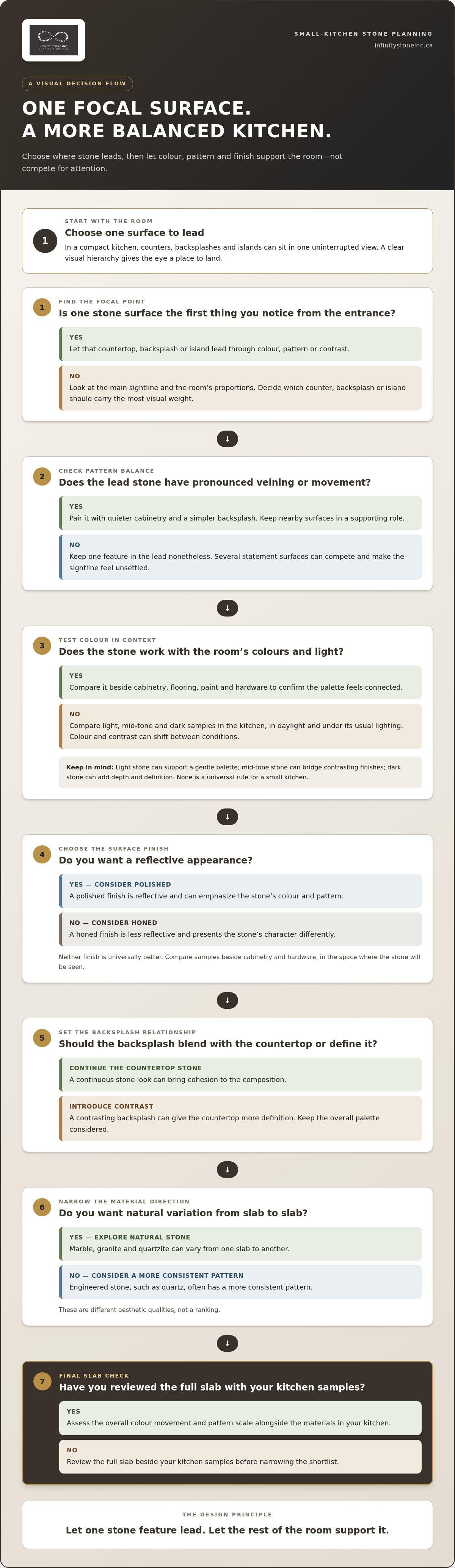
- Making a small kitchen look luxurious with stone starts with visual balance: choose one surface to lead, then let surrounding materials support it.
- Compare light, mid-tone and dark stones alongside your cabinetry, flooring and lighting rather than relying on universal colour rules.
- Use veining direction and pattern contrast to create a focal point without adding visual competition.
- Decide whether the backsplash should continue the countertop stone for cohesion or introduce contrast for definition.
- Review full slabs alongside your kitchen samples to assess colour movement and pattern scale before narrowing your shortlist.
Making a Small Kitchen Look Luxurious with Stone Starts with Visual Balance
Luxury in a compact kitchen comes from deliberate choices, not the amount of stone in view. A thoughtfully selected countertop, a coherent relationship between surfaces and carefully considered details can feel more elevated than stone applied everywhere. Give the eye a clear place to land, then let the cabinetry, flooring and other finishes complete the composition.
Limited floor area makes sightlines especially important. From the entrance, a nearby counter may lead the eye straight to the backsplash or island, putting those surfaces at the centre of the room’s visual experience. The layout matters, too. The kitchen work triangle describes the relationship between key work areas, a useful reminder that stone choices should complement how the space functions as well as how it looks.
Visual hierarchy in a compact kitchen means giving one stone feature priority while keeping nearby materials in a supporting role. Depending on the room’s proportions and sightlines, that feature could be a distinctive countertop, a continuous backsplash or an island surface.
Why stone has an outsized effect in a compact kitchen
Countertops, backsplashes and islands occupy prominent surfaces at eye level or close to it. In a smaller room, these elements may sit within one uninterrupted view, so their colours and patterns relate to each other immediately. A restrained palette can make that view feel composed. For example, pair a countertop with visible movement with quieter cabinetry and a simpler backsplash.
A focal point is different from several statement surfaces competing for attention. If the countertop has pronounced veining, a similarly dramatic backsplash and a strongly patterned island may make the room feel unsettled. Choose one lead feature, then repeat a few compatible tones elsewhere to give the overall design a sense of connection.
The small-kitchen luxury misconception: more stone is not always better
Covering every available surface in stone may seem like the surest way to create a premium impression, but quantity alone doesn’t establish refinement. Repeated veining across counters, walls and an island can fragment the sightline. Multiple contrasting finishes can also make every surface demand attention. Strategic placement gives the chosen material room to register.
Start by assessing the room itself. Note how much natural light reaches the work surfaces, where the main view begins and whether an island or backsplash will dominate the composition. A bold slab may suit a compact kitchen when the surrounding palette is calm. A quieter pattern may better support a room with several visible finishes. Neither approach is a universal rule.
- Identify the first stone surface visible from the kitchen entrance.
- Choose whether it should lead through colour, pattern or contrast.
- Keep the remaining surfaces supportive rather than giving each one equal visual weight.
This balance is a practical starting point for making a small kitchen look luxurious with stone. It helps narrow the design direction before you compare individual slabs, so the material responds to the room rather than overwhelming it.
Choose Stone Colour and Finish to Shape the Room’s Atmosphere
Colour and finish influence how a compact kitchen feels, but neither works in isolation. Cabinet colour, daylight, flooring and nearby surfaces all affect how much contrast the stone creates. Judge the material as part of the room’s palette instead of relying on general rules such as light kitchens always feeling larger or dark stone being unsuitable for small spaces.
Light, dark, and mid-tone stone in a small kitchen
Light stone can create a bright, gentle mood, particularly beside pale cabinetry, but it won’t automatically make a kitchen feel more spacious. With white cabinets and strong daylight, a light surface may blend into the room. Against darker cabinets, it can become a crisp focal point. Mid-tone stone can bridge contrasting finishes, while dark stone may give a compact kitchen depth and definition when balanced with the surrounding palette.
Before deciding, place sample boards beside cabinet and paint choices in the kitchen itself. Compare them in daylight and under the room’s usual lighting, since colour and contrast can shift between conditions. Include flooring and hardware. A stone that seems harmonious on its own may read very differently beside warm wood, cool paint or metallic accents.
Polished or honed: choosing a finish for the intended mood
A polished finish has a reflective appearance that can emphasize colour and pattern. A honed finish is less reflective and presents the stone’s character differently. Neither is universally better. Choose based on the mood you want and how the finish relates to cabinetry, lighting and hardware. If possible, compare samples side by side in the space where the stone will be seen.
Natural stone, including marble, granite and quartzite, can vary from one slab to another. Engineered stone, such as quartz, often has a more consistent pattern. These are different aesthetic qualities, not a ranking. If the natural movement of quartzite interests you, explore this premium quartzite slab guide as you shape your material direction.
| Design priority | Colour and finish to consider |
|---|---|
| Soft, bright atmosphere | Light stone can support a gentle palette. Compare it with cabinet and wall colours to ensure the surfaces don’t visually merge. |
| Defined contrast | Dark or mid-tone stone can establish a focal point. Assess how it reads beside cabinetry and in the available daylight. |
| Quiet material presence | A honed finish may feel more understated, while a polished finish has a more reflective appearance. |
| Distinctive or consistent pattern | Compare the variation in natural stone with the more consistent patterns often found in engineered stone. |
For making a small kitchen look luxurious with stone, choose the material that feels composed alongside the room’s fixed finishes. Compare full slabs where possible: seeing the complete surface helps reveal its overall colour movement and pattern scale. Infinity Stone Inc. supplies a selection of natural and engineered stone slabs to help you refine your shortlist.
Use Veining and Slab Pattern to Create Focus, Not Clutter
A slab’s pattern has a visual direction as well as a colour. Veining that travels across a counter can draw the eye along the run, while diagonal movement may create a stronger sense of energy. High contrast makes individual veins more prominent; softer contrast lets the pattern recede. In a compact kitchen, these qualities shape how the eye moves between the countertop, cabinetry and adjacent surfaces.
Pattern scale only makes sense in the context of the whole room, because a striking vein on a small sample may read very differently across a countertop and backsplash. A swatch alone can’t show how the pattern will interact with cabinet doors, seams, corners and the countertop footprint.
When subtle movement supports a refined small-kitchen design
A restrained pattern can bring depth without competing with detailed cabinetry, expressive handles or other strong finishes. Low-contrast movement may also help compact surfaces feel visually connected, especially where the counter and backsplash share one sightline. But quiet stone isn’t automatically the better choice. If the cabinets and hardware are simple, a more expressive pattern may provide the character the room needs.
Look for repetition as well as contrast. Closely spaced marks or recurring veins can create a busy rhythm when repeated across multiple surfaces. A subtler pattern may offer a calmer backdrop while still adding natural variation. Compare the stone with the kitchen’s actual cabinet layout: a pattern that feels balanced beside broad, uninterrupted doors may appear more active next to narrow panels or open shelving.
How to use a dramatic stone pattern with intention
Pronounced veining can become the defining feature of a small kitchen. Let it lead, and keep nearby visual statements quieter. For example, a counter with strong movement may pair more coherently with simple cabinet fronts and a less assertive backsplash than with several competing patterns. If you’re considering marble, explore this premium marble slab guide while weighing the character of its veining.
Orientation matters. Veins running lengthwise can emphasize the direction of a counter run; crosswise or diagonal arrangements create a different visual effect. Consider where the visible pattern will fall in relation to the sink, cooktop, corners and any joins between surfaces. The planned cut and countertop footprint determine which parts of the full slab will be seen, so review the slab with those dimensions and the cabinet layout in mind.
- Trace the pattern’s direction and note where its strongest contrast appears.
- Compare the slab’s overall movement with the length and shape of the intended counter surface.
- Check whether nearby finishes repeat or compete with the stone’s pattern.
Viewing a full slab can reveal transitions and areas of stronger movement that a small sample won’t show. For making a small kitchen look luxurious with stone, assess the complete pattern as part of the room’s composition, not as an isolated feature. That makes it easier to decide whether the stone should quietly support the design or serve as its most memorable detail.
Place Stone Strategically Across Countertops, Backsplashes, and Islands
Plan stone placement in sequence. First, choose the surface that will lead the design, often the main countertop. Then decide whether the backsplash and any island or peninsula should repeat that material, complement it or provide contrast. This order helps each choice relate to the room’s proportions instead of treating every surface as a separate statement.
Coordinate countertop and backsplash without overloading the room
A backsplash in the same stone as the countertop can create a continuous visual plane, especially where the two meet along a short counter run. A quieter complementary surface can let a patterned countertop remain the focus. Contrast is another option: a distinct backsplash can define the counter area, provided its colour and pattern work with the cabinetry rather than interrupting the sightline. For those considering sleek, light-reflective vertical features alongside traditional slabs, architectural surface specialists like FGD Glass Solutions offer stone-glass and decorative panels that add depth while keeping sightlines open.
Height changes the effect. A limited-height backsplash preserves more of the wall and cabinet lines, while a full-height treatment extends the stone upward and gives it a larger visual presence. In a compact kitchen, consider what’s visible from the entrance and how the pattern aligns with cabinet edges. Repeating a bold surface across the backsplash may feel cohesive in one layout but visually dense in another.
Decide whether a small island should be the stone focal point
An island or peninsula can anchor the room if it’s clearly visible from the entrance or an adjoining living area. A distinctive surface there may balance simpler perimeter counters and create a focal point beyond the main work area. If the island sits within an already busy sightline, repeating the primary countertop material or choosing a visually quieter surface may produce a more composed result.
Review cabinetry, lighting and hardware alongside the stone. A surface that looks compelling on its own may feel disconnected beside warm-toned cupboards, prominent pendants or strongly contrasting handles. Compare samples in the room and consider how the planned surfaces meet at corners, edges and transitions. For broader inspiration when coordinating surrounding architectural elements, surface finish specialists like Nasuru Interiors demonstrate how carefully selected decor materials can harmonize with a focal stone installation.
- Choose the primary stone surface based on the kitchen’s layout and main sightline.
- Decide whether the backsplash should repeat, complement or contrast with that surface.
- Assess an island or peninsula as a focal point only if its position supports that role.
- Compare the full palette, including cabinetry, lighting and hardware, before settling on the combination.
This sequence makes making a small kitchen look luxurious with stone a practical design exercise, not a question of adding stone everywhere. Infinity Stone supplies natural and engineered stone slabs, including quartzite, quartz, granite, marble and porcelain, to homeowners and industry professionals in Ontario. Explore stone slab options as you refine a placement plan for your kitchen.
Turn Your Small-Kitchen Stone Plan into a Confident Slab Shortlist
A clear shortlist turns a design direction into a practical material decision. Rather than browsing every colour and pattern, use the room’s layout and chosen focal surface to guide what you compare. This keeps your selection grounded in the kitchen’s actual palette and proportions, and helps you judge whether a slab supports the atmosphere you want.
A practical five-step process for reviewing stone slabs
- Set the visual priority. Decide whether the countertop, backsplash or island should lead the design. Note what’s most visible from the kitchen entrance and adjoining rooms.
- Choose a material direction. Narrow your options to a category, such as marble, quartzite, granite, quartz or porcelain. Then identify a colour family, finish and pattern character that suit the room.
- Bring the kitchen palette. Compare slabs with cabinet, flooring and paint samples, plus hardware or other prominent finishes. Clear photographs taken in natural light can help if physical samples aren’t available.
- Review the full slab and intended layout. Look at the overall colour movement and pattern scale, then consider how the visible area may relate to the countertop footprint, backsplash height or island shape. Approximate dimensions and layout drawings make this comparison more specific.
- Record and compare your finalists. Photograph each shortlisted slab beside your palette, where possible, and label the images. Review them together later, considering how they look in the kitchen’s daylight and artificial lighting.
Keep the shortlist focused. A few well-considered options make it easier to compare meaningful differences in veining, contrast and finish than a long collection of unrelated samples. If engineered quartz fits the direction you’re exploring, this guide to premium quartz countertops in Mississauga offers further material context.
What to bring into a stone-selection visit
Bring cabinet, flooring and paint samples, or clear photographs taken in natural light. Include approximate measurements for the surfaces you’re considering and any available layout drawings. These references help you assess a slab against the room’s actual finishes and intended placement, rather than relying on memory or a small sample alone.
As you compare, ask whether each option supports the overall design priority. Does the pattern suit the visible counter area? Does the colour relate comfortably to the cabinetry? Does the finish feel coherent under the lighting? For making a small kitchen look luxurious with stone, these practical checks help turn an appealing slab into a considered choice.
Explore Infinity Stone’s natural and engineered stone slabs to begin building a shortlist that reflects your kitchen’s palette, layout and focal surface.
Choose a Stone Direction That Feels Like Yours
The final choice should feel at home in your kitchen, not simply impressive on a slab. Compare the options on your shortlist against the finishes and light you live with every day. A considered decision can make the space feel personal and enduring, whether your design leans towards natural variation or a more consistent surface.
For making a small kitchen look luxurious with stone, choose the material that brings the room together and suits the atmosphere you want. Infinity Stone supplies natural and engineered stone slabs from its Mississauga base to customers in Ontario.
Explore Infinity Stone’s premium stone slabs for your kitchen and start building a shortlist around your kitchen’s palette, layout and focal surface.
Frequently Asked Questions
Can a small kitchen use a dramatic stone pattern?
Yes. A compact kitchen can suit expressive veining if the pattern has a deliberate role. For example, let a dramatic countertop lead while choosing simpler cabinet fronts and keeping nearby surfaces visually quiet. Before deciding, consider how the slab’s direction and strongest markings will fall around the sink, corners and cut-outs. Making a small kitchen look luxurious with stone is about using character with intention, not avoiding it.
Does light-coloured stone always make a small kitchen look bigger?
No. Light stone can contribute to an airy feel, but its effect depends on the complete palette and the light in the room. Beside dark cabinets, a pale counter may create crisp contrast rather than blend into the space. Compare samples beside your cabinetry and paint at different times of day, including under evening lighting. This helps reveal whether the stone feels calm, bright or visually prominent in your kitchen.
Should the countertop and backsplash use the same stone?
They can, but matching isn’t essential. Repeating the countertop material on the backsplash can make a short work area feel visually continuous. A complementary surface may be a better fit if the counter has prominent markings or if you want the wall area to feel quieter. Consider how much backsplash will show between the counter and cabinets, and whether its pattern aligns with cabinet edges and nearby sightlines.
Is a polished stone finish a good choice for a compact kitchen?
It can be. A polished finish has a reflective appearance that may give the surface a crisp, luminous quality, while a honed finish tends to look more subdued. The right choice depends on the atmosphere you want and how the surface relates to lighting, cabinet colour and hardware. Compare finish samples beside those elements, then view them under both natural and artificial light before narrowing your selection.
Can a small kitchen have both a stone island and stone countertops?
Yes, if the two surfaces feel related rather than competing. If the island is the first feature seen from an adjoining dining area, it could carry the stronger pattern while perimeter counters stay quieter. Alternatively, repeating the same stone can create a more unified look. Consider the island’s size, position and visibility, along with cabinet finishes, so the combined surfaces feel deliberate rather than visually crowded.
How should I compare a stone sample with the full slab?
Use a sample to assess colour and finish, then view the full slab to understand its broader pattern and variation. Place cabinet, flooring and paint samples beside it, and bring a layout drawing or approximate measurements to consider the planned cuts. Take reference photographs in consistent lighting so you can compare shortlisted options later. This gives you a clearer sense of how the stone may relate to the kitchen as a whole.


